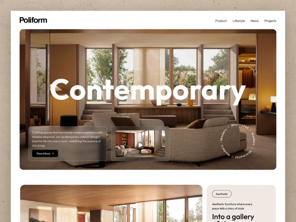
In today’s digital-first world, your business website is often the first point of contact between you and potential customers. It’s your storefront, sales team, and marketing hub all rolled into one. A well-designed website can convert visitors into loyal customers, while a poorly designed one can drive them away in seconds. But what exactly makes a website effective?
To stand out and turn visitors into leads, there are a few key elements every business website must have. These essential features will not only enhance the user experience but also encourage visitors to take the next step—whether that’s contacting you, signing up for a service, or making a purchase. Let’s dive into the five essential features that should be on your business website today.
1. Clear and Engaging Homepage Message
Your homepage is the first impression visitors get of your business. It needs to be both visually appealing and crystal clear about who you are, what you offer, and why it matters to your target audience. Here’s what it should include:
- Headline: Your headline should communicate your business’s value proposition in a matter of seconds. Visitors should immediately understand how your product or service solves their problem.
- Sub-Headline: Offer more detail on your services or products, emphasizing how they can benefit the user.
- Call to Action (CTA): A strong, visible CTA (like “Get a Free Quote” or “Schedule a Consultation”) invites visitors to take immediate action.
Without a clear message, potential customers may become confused or lose interest quickly. Ensure your homepage clearly answers the questions: “What do you do?” and “How can you help me?”
2. Mobile-Friendly and Responsive Design
Did you know that over 50% of web traffic comes from mobile devices? If your website isn’t optimized for mobile viewing, you’re likely losing a huge number of potential leads. A mobile-friendly design means your website automatically adjusts to look good and function properly on any device—whether it’s a desktop, tablet, or smartphone.
- Responsive Layout: This ensures that your site’s content is readable and easily navigable across all screen sizes. A responsive design adapts images, buttons, and text to fit appropriately on different devices.
- Fast Loading Speed: Mobile users expect websites to load quickly. A site that takes more than a few seconds to load is likely to cause visitors to bounce away.
By ensuring your website is mobile-friendly, you create a seamless experience for all users, no matter how they access your site.
3. Easy-to-Navigate Structure
A user-friendly website structure is crucial for keeping visitors engaged. If they can’t find what they’re looking for easily, they’ll leave and likely never return. Your website should make navigation intuitive and effortless. Here’s what to consider:
- Clear Menu: A straightforward and concise navigation bar at the top of your site helps users quickly find the information they need.
- Breadcrumbs: These are small text paths that show visitors where they are on your site (e.g., Home > Services > Web Design), helping them backtrack easily if necessary.
- Search Functionality: For larger websites, a search bar allows users to quickly find specific content.
When users can find what they’re looking for without any hassle, they’re more likely to stay longer and engage with your offerings.
4. Strong Calls to Action (CTAs)
Every business website needs well-placed and compelling calls to action to guide users toward the next step. Whether you want visitors to sign up for a newsletter, book a consultation, or purchase a product, your CTAs should be direct and persuasive.
- Use Action-Oriented Language: Instead of using vague CTAs like “Learn More,” opt for more specific phrases like “Get Your Free Consultation” or “Start Your Free Trial.”
- Keep it Simple: Don’t overload your pages with too many CTAs. Focus on the key actions you want your visitors to take and make those stand out.
- Use Contrasting Colors: Make sure your CTAs are visually distinct from the rest of the page, drawing attention without being overbearing.
A strong CTA can be the difference between a visitor simply browsing your website and becoming an active lead.
5. Trust-Building Elements
For a visitor to take action on your site, they need to trust your business. Including trust-building elements throughout your website can significantly boost your credibility and increase conversions. Some essential trust indicators include:
- Testimonials and Reviews: Positive feedback from satisfied customers helps new visitors feel confident about your services.
- Case Studies or Portfolios: Showcasing the results you’ve delivered for other clients can reinforce your expertise and value.
- Security Badges: If you handle sensitive information, displaying SSL certificates or trust seals can reassure users that their data is safe.
- Contact Information: Make it easy for users to contact you by including your phone number, email, or a simple contact form on multiple pages.
Building trust with your audience is key to turning website visitors into loyal customers. By including these elements, you create a sense of reliability and professionalism.
Conclusion
Your business website is the cornerstone of your online presence, and ensuring it includes these five essential features will not only improve the user experience but also increase your chances of turning visitors into paying customers. If your website is missing any of these key elements, it might be time for a redesign or update.
Ready to upgrade your website and start converting more leads?
Reach out to us today to discuss how we can help you integrate these essential features into your site and take your online presence to the next level.


